


"Shopping around" used to require actually visiting a few stores to see what they had inside. Today, many consumers learn about products they intend to buy online — especially big-ticket items — and then go to one store to purchase them. Given this shift in buying patterns, pool and spa dealers and builders can't afford a poor Web presence. So what makes a Web site great. To a degree, it's based on personal taste, but guidelines for creating an effective and attractive site do exist. For example, judges determining winners of Webby Awards, which have been called "The online Oscars" by Time magazine, use a specific set of criteria that serves as a useful general reference. Each criterion is explained below, and after each explanation, Jill Nebeker, Web editor at Athletic Business Publications in Madison, Wis. (AQUA's parent company), talks about how these criteria can be applied to pool and spa Web sites, and offers examples of sites that have met or exceeded them.
Content
Webby Awards' explanation: Content is the information provided on the site. It's not just text, but music, sound, animation or video — anything that communicates a site's body of knowledge. Good content should be engaging, relevant and appropriate for the audience. You can tell it's been developed for the Web because it's clear and concise, and it works in the medium. Good content takes a stand. It has a voice, a point of view. It may be informative, useful or funny, but it always leaves you wanting more.
JN: I'm a conservative when it comes to content. I recommend that "extra" content (audio, video) not get in the way of the user's quest for information. You've probably been to a Web site with a fancy first page with one of those bars that tells you what percent of the page has loaded. You wait, then the page loads, you see a pretty picture or some animation. Underneath it is the option to "Skip Intro." That's an example of content getting in the way of what users are after. Users want that next page, not the "skip intro" page.
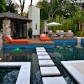
For visual content, spend some serious time and energy in creating your gallery or portfolios. Having quality shots of your projects online shows customers what kind of work they can expect from you. Erickson Pools' site, ericksonpools.com, displays pools nicely in its gallery with thumbnails on the left, which can be clicked to see larger versions of the photos.
Because photographs are so important in this industry, I recommend hiring a professional to take photos of your projects that will be posted on your site. In terms of other artwork for your site, if it's needed, there are several good stock-photo sites with very affordable photos. For example, istockphoto.com returned 595 results when I searched for "hot tub."
For written content, always err on the side of brevity. The shorter the better — as long as it's clearly communicating what you want it to. On the Web, you have about a two-second window to convince a user to stay on your site. If they have to wade through a lot of verbiage, you've probably already lost them. Olympichot tub.com, the site for the Olympic Hot Tub Company in Seattle, does a good job on this front with articles on the health benefits of spas and hot tub etiquette.
Structure And Navigation
Webby Awards' explanation: Structure and navigation refers to the framework of a site, the organization of content, the prioritization of information and the method in which you move through the site. Sites with good structure and navigation are consistent, intuitive and transparent. They allow you to form a mental model of the information provided, where to find things and what to expect when you click. Good navigation gets you where you want to go quickly and offers easy access to the breadth and depth of the site's content.
JN : Think about site navigation before the site is built. It's a great process to go through not just for a Web site, but also for uncovering what is important to your business. It's clear in a site like drakeleypools.com (Drakeley Swimming Pool Company) that some time went into deciding what would go where on the site. As a user, I can rely on the navigation bar being in the same place, and it's clear to me what links such as "Portfolio" or "Testimonials" lead to — and the site doesn't disappoint. I find what I expected to find.
When planning your site navigation, a good place to start is to identify the three things that a customer will want from your Web site. Topping the list are location and phone number. That can be a page of its own, but should also be on every page.
Next, decide which products you carry will be featured on the site. This is where it gets interesting. You have to think through what categories to put products into, what to call those categories and how users will be able to move between the categories.
A crucial decision to be made at this time is whether customers will be able to purchase anything from your Web site. E-commerce requires a lot of planning to create the best path to navigate through the products, how they will be able to change what items they've selected and what e-commerce technology the site will use.
Next, make a list of questions that customers call you with and also what kinds of questions you are asked while showing products to customers. Answers to these questions can form another section — or more — on the site.
Actually drawing the site on poster board or laying out different colored Post-it notes on a table is a quick and visual way to go through the process. Doing this will put you ahead of the game so that you're not figuring this out as the site is being built — or worse, trying to fix it after the site is live.
Visual Design
Webby Awards' explanation: Visual design is the appearance of the site. It's more than just a pretty home page, and it doesn't have to be cutting edge or trendy. Good visual design is high quality, appropriate and relevant for the audience and the message it is supporting. It communicates a visual experience and may even take your breath away.
JN: Web sites for the pool and spa industry have a real advantage over other industries. The products, the settings for the products and the emotions evoked by the products invite beautiful design. I'm a real fan of sundancespas.com, which uses a Flash-based slide show with some semi-transparent color boxes with text over the photos. The site is able to do two things at once: create an emotional response while communicating a message with text. Meanwhile, clear, easy-to-find navigation surrounds the slide show. And the whole Sundance Spas site uses a color scheme that to me feels outdoorsy but also has classic feel to it. One other thing I'll mention about this Web site is that the logo is prominent and always in the same spot (that's the most important item on a Web site design to-do list), but the logo is neither overbearing nor too large, so it doesn't take up important real estate on the page.
Functionality
Webby Awards' explanation: Functionality is the use of technology on the site. Good functionality means the site works well. It loads quickly, has live links, and any new technology used is functional and relevant for the intended audience. The site should work cross-platform and be browser independent. Highly functional sites anticipate the diversity of user requirements from file size to file format and download speed. The mostfunctional sites also take into consideration those with special access needs. Good functionality makes the experience center stage and the technology invisible.
JN: It's not part of the pool and spa industry, but my favorite example of good functionality is the "Explore Color" portion of the Behr Web site, at behr.com. It takes a little while to load (even on a DSL connection), but it's worth it for anyone with a painting project. Once the site loads, you can play with different color combinations, working within color families or using Behr's recommendations for rooms. You can lighten and darken colors, see what they'd look like in a room and change individual colors.
If you have the budget for it and offer a variety of products, then an online build-your-own pool, spa or backyard oasis could help customers familiarize themselves with your products. A good model for this type of functionality is found on the Great Lakes Spas site, at lifeisgreatlakes.com/product_designer.htm. After customers choose size, colors and extras, they can print out the specs and bring them into the store, giving everyone a great place from which to begin the purchase.
If you go this route, find examples of what kind of functionality you're after and then hire a Web developer/programmer with advanced skills that has a similar project already in his or her portfolio. Most small business owners won't have the need for something as complex as the behr.com site. My advice is to stick with what you know. Adding some functionality just for the sake of functionality is not going to draw users to your site or increase sales.
Interactivity
Webby Awards' explanation: Interactivity is the way a site allows you to do something. Good interactivity is more than a rollover or choosing what to click on next; it allows you, as a user, to give and receive. It insists that you participate, not spectate. It's input/output, as in searches, chat rooms, e-commerce and gaming or notification agents, peer-to-peer applications and real-time feedback. It's make your own, distribute your own or speak your mind so others can see, hear or respond. Interactive elements are what separates the Web from other media. Their inclusion should make it clear that users aren't reading a magazine or watching TV anymore.
JN: I don't think interactivity should play much of a role in a pool and spa dealer Web site. Gaming and video are expensive and aren't relevant to what the customer is hoping to do on your site: get more information about buying a pool or spa.
Forums or chat rooms aren't likely to get much traffic on a small business consumer site, either. However, other forms of interactivity can work. The "Build Your Own Hot Tub" feature on lifeisgreatlakes.com allows users to interact with the products on the site. Also, olympichottub.com has two interesting interactive items: the "Reserve Your Free Test Soak" and the "Free PerfectFit Backyard Consultation." For each item, after filling out a form, Web site users become customers who either come into the store or invite an Olympic salesperson into their home. Either way, they've opened to the door a hot tub sale.
Also, having a place on your site to post comments from customers about their experience with you and/or your store is a great idea. Somewhere in the feedback form clients fill out (which you'll probably want available on the Web site and elsewhere), be sure they consent to having their comments posted to your site. I recommend having a form that sends an e-mail to you after the comments are submitted. From there you can post it on the site.
Overall Experience
Webby Awards' explanation: Demonstrating that sites are frequently more — or less — than the sum of their parts, the overall experience encompasses content, structure and navigation, visual design, functionality and interactivity, but it also includes the intangibles that make one stay or leave. One has probably had a good overall experience if he or she comes back regularly, places a bookmark, signs up for a newsletter, participates, e-mails the site to a friend or stays for a while, intrigued.
JN: One aspect of Web site design and development that can't be pinned down is user response to the overall experience. Just as people like different kinds of art, people will respond in varying ways to different kinds of Web site design. For example, I'd rather see a site that has lots of information, and it's easy for me navigate, like olympichothub .com. However, others are drawn to the visual appeal of a site like groupworksllc.com, which relies heavily on an artful experience with a black and gray background and slide shows displaying gorgeous photos of water installations. There isn't a solution to the challenge of appealing to everyone, so the best thing to do is to design the look and feel of your site to match the personality of your business.